Author Archives: vincent

Trophies VI – spirals

One of my lines of thought for trophies has been how to represent exponential growth in social media – the trophy is supposed to be for someone [or group] who/which has contributed to social development using the internet.  I thought that spirals might might be a starting point but  how to do that??

Did think of how lots of straight lines can form a curve….

IMG_5462

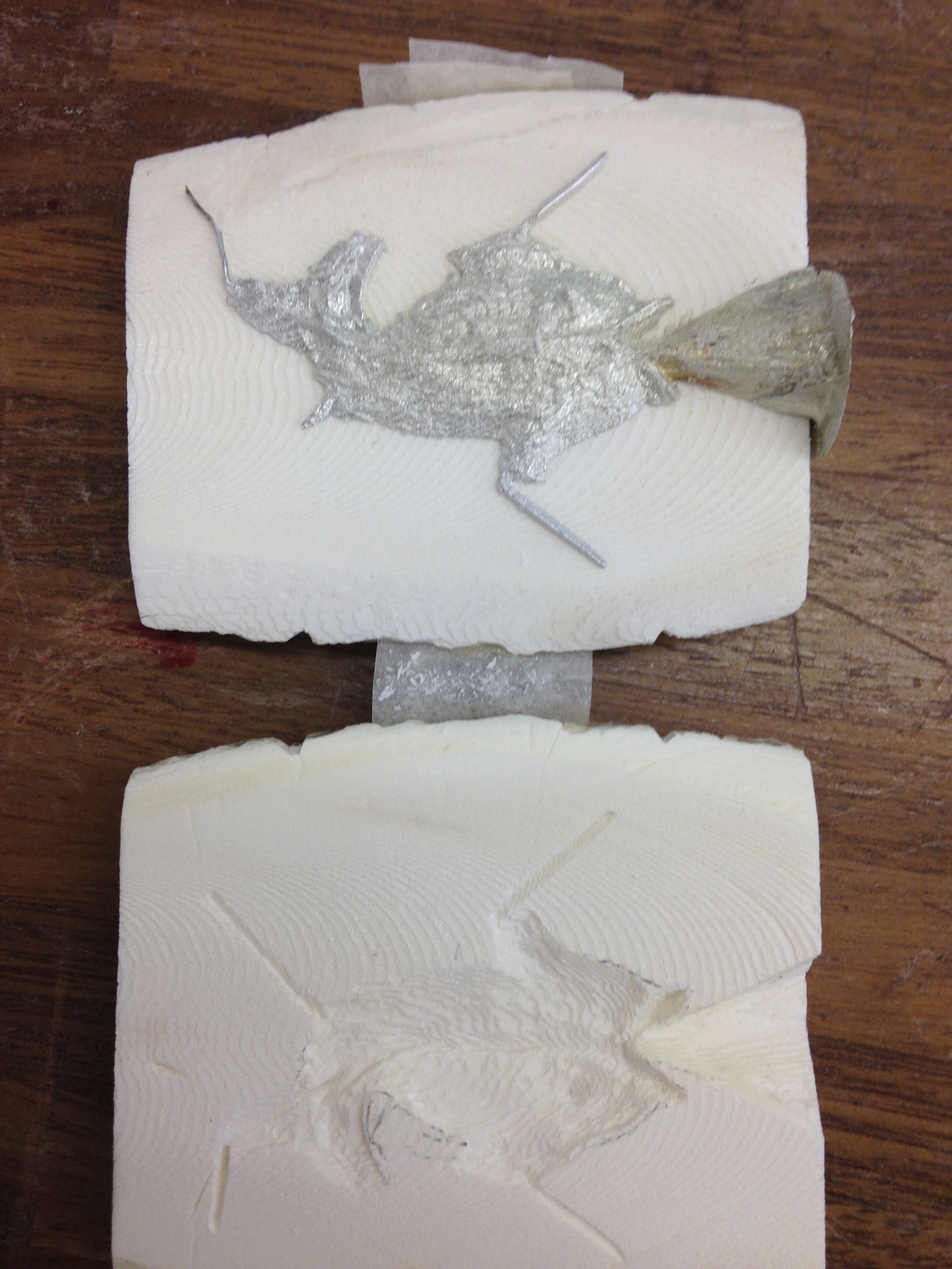
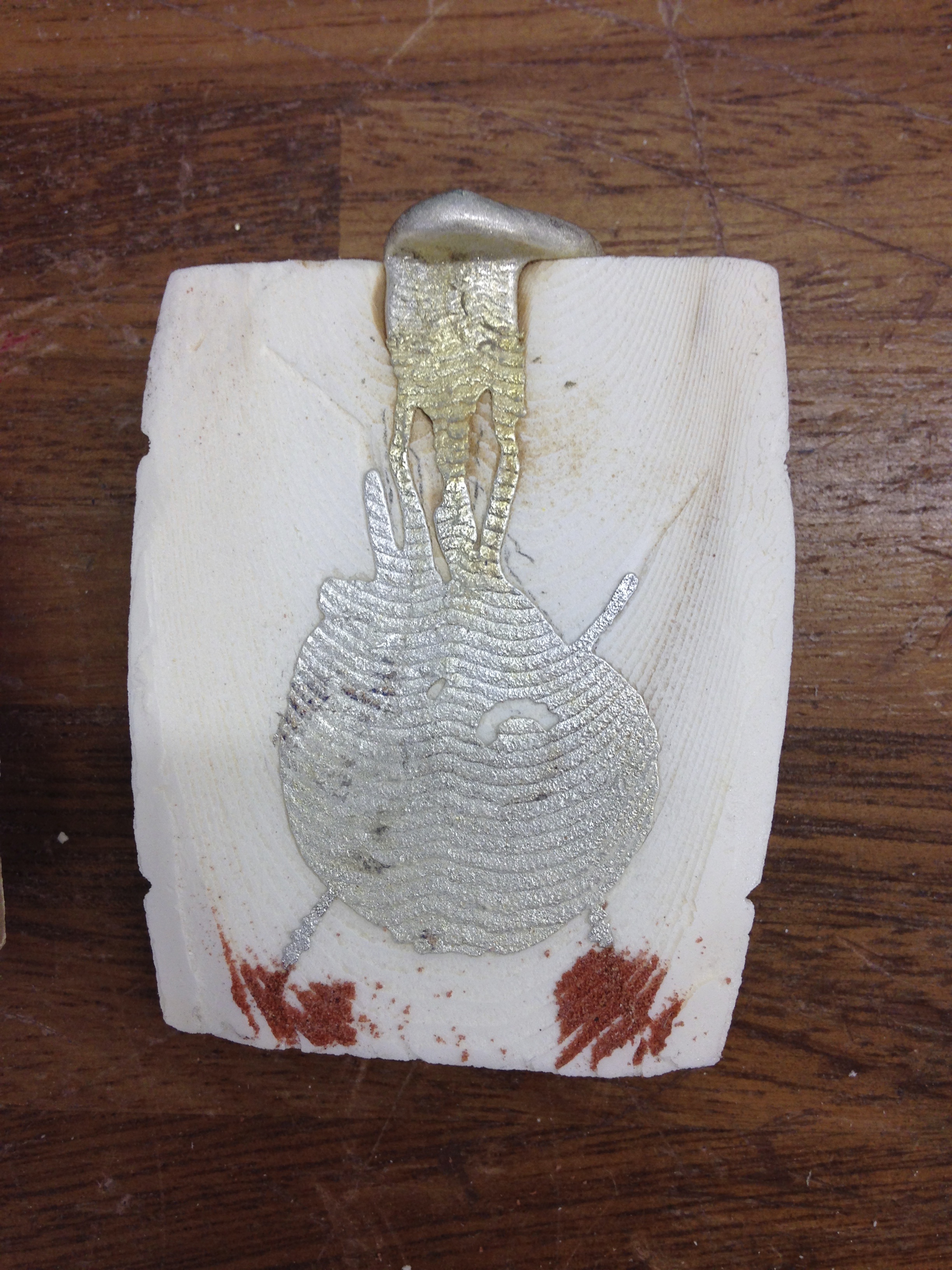
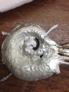
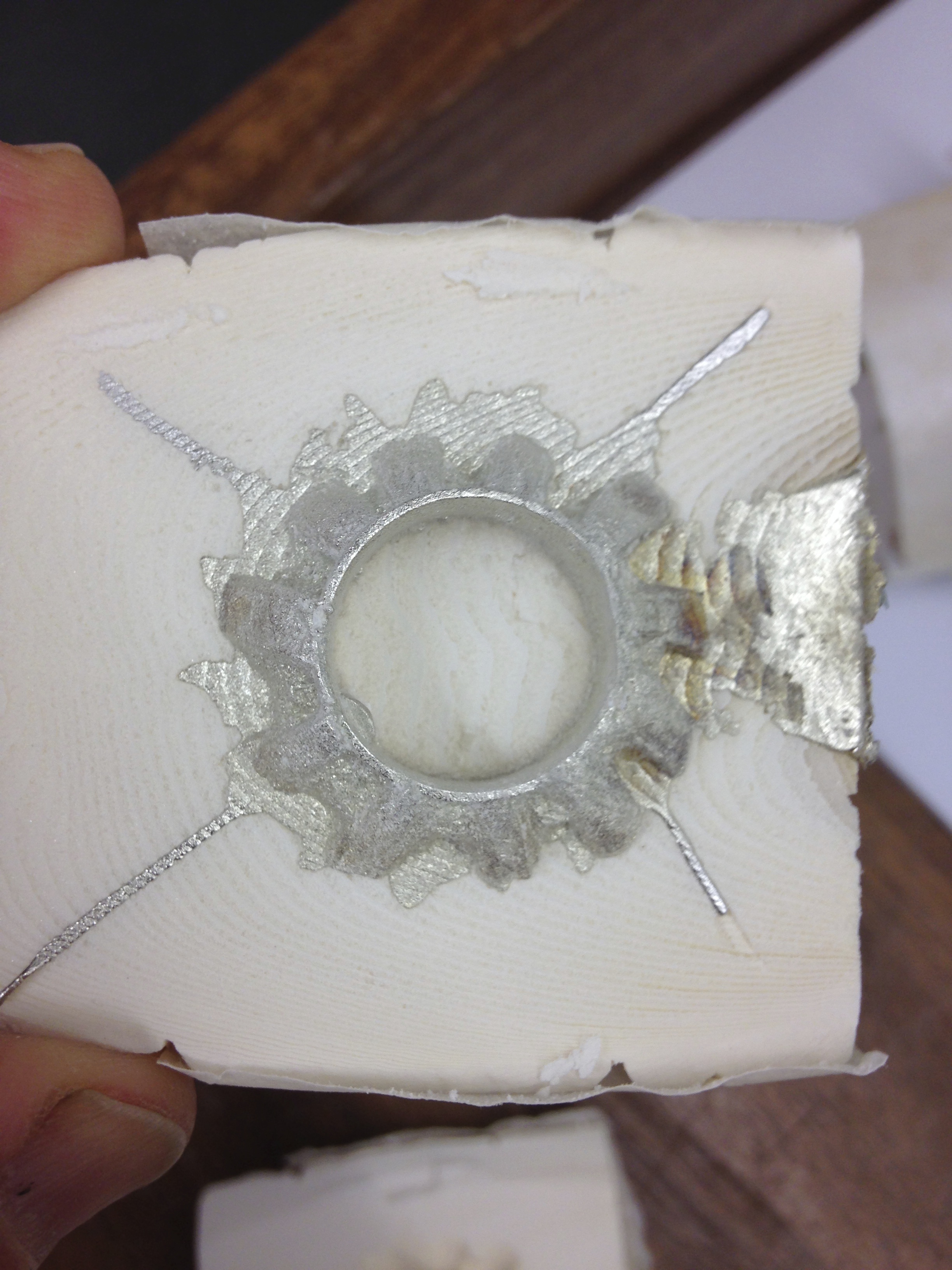
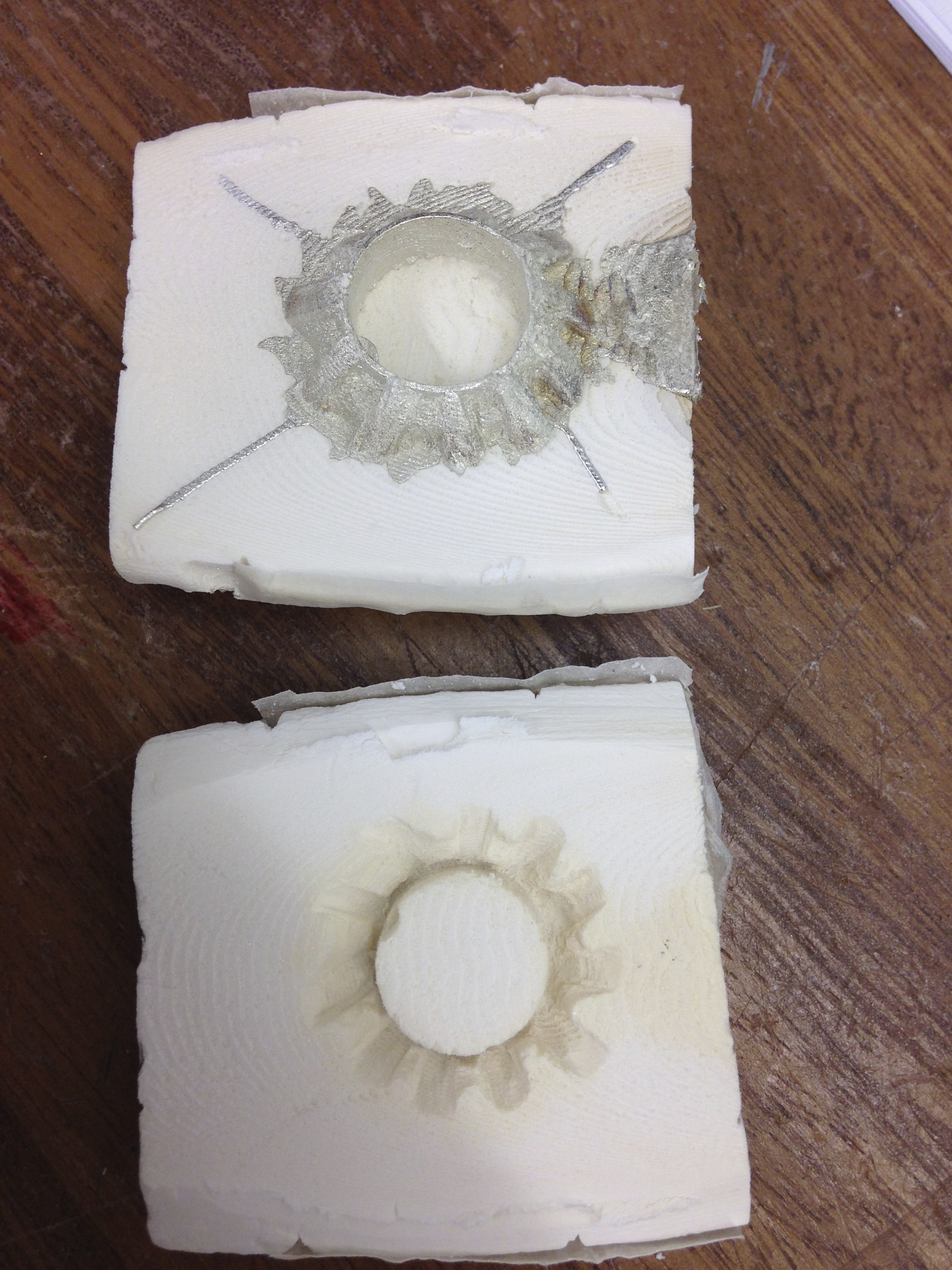
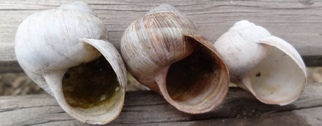
… And used fine brazing rod spot-welded together: Takes a lot of care to get it hot enough to form an acceptable weld but not too hot to melt both rods and have it go floppy or fall apart.  Samples made so drew out a spiral quickly using a compass [draw increasing quadrants with each one meeting its neighbour as if smooth curve – I’ll draw it out as a blog if asked!].  BIG MISTAKE!.  In my rush to get something manageable and enough spiral I made an Archimedean spiral [constant rate of growth] rather than one with exponential [logarithmic] growth, like in snail shells.

IMG_5460DSC07473DSC07474


Not the first time something like that has happened, the logarithmic spiral sometimes called the Spira mirabilis, [Latin for “miraculous spiral”], was of great interest to the mathematician  Jacob Bernoulli for how many things remain constant in such spirals as they evolve.  Because of his fascination with the spire mirabilis,  Jacob wanted such a spiral engraved on his headstone along with the phrase “Eadem mutata resurgo” (“Although changed, I shall arise the same.”), but, by error, an Archimedean spiral was placed there instead.

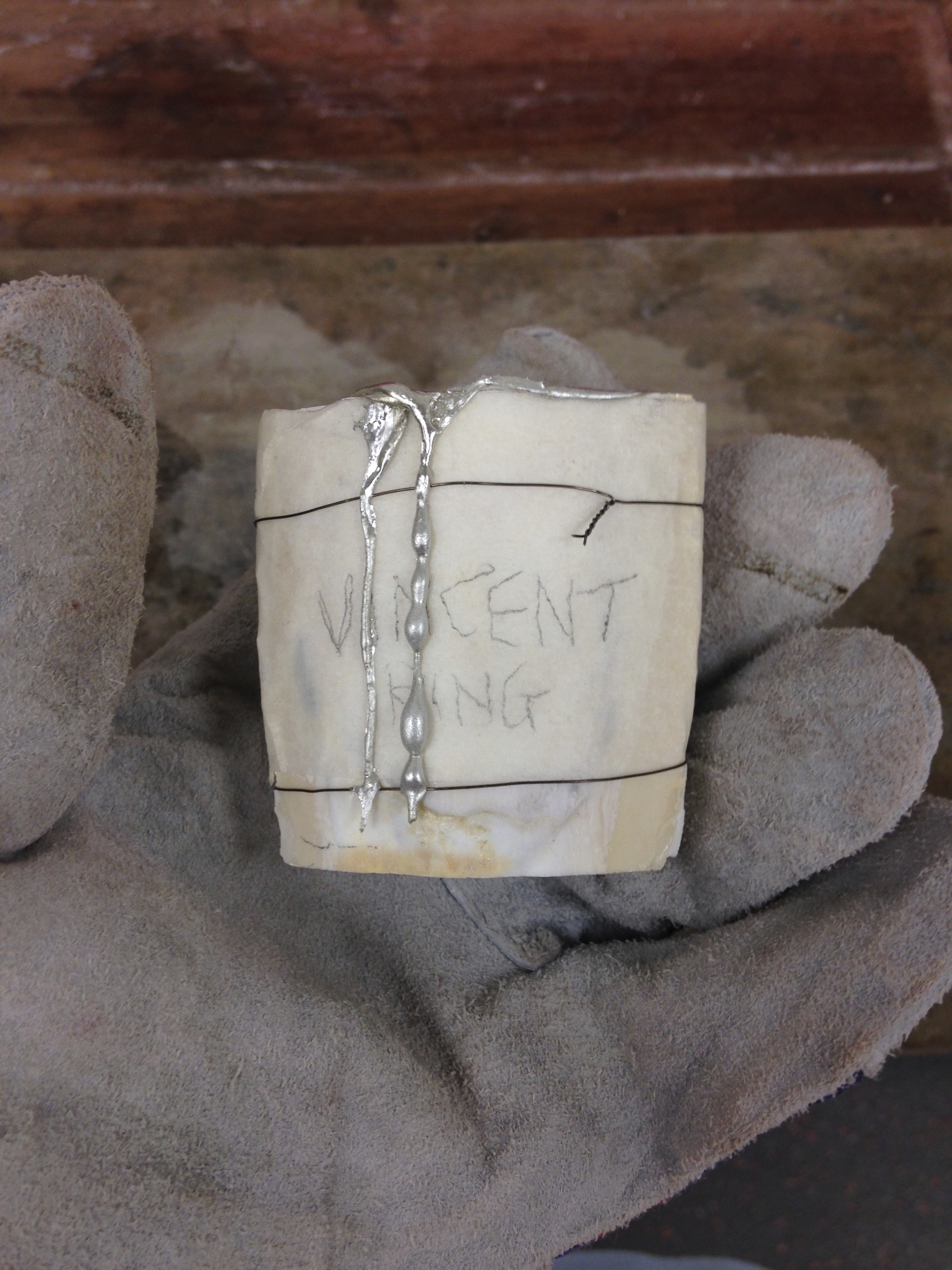
Hey ho, back to the drawing board as it were….  Vincent

Trophies V – More bowls!

I’ve been trying to throw bowls on the potters wheel but thought I would not publish the results until I had glazed them; then there’s the opportunity to comment on shape and glaze all in one go [and not bore you with sowing them twice],

The pictures are in the order of throwing; some pots in clay from the college’s pug mill and some in posh stuff straight from the bag.  Earlier stuff made it into the kiln for bisque firing before I got round to tidying the bases – hence the rough bottoms.

The glazing is interesting in so far as the type of clay affects how the glaze appears with the iron in the pugged clay adding more brown to the end result. So, the “blue” on the second bowl is the same glaze as on the fourth bowl and the greeny/grey on the third bowl is the same glaze as on the last bowl.   Also, the pugged clay apparently had some “terracotta” clay in it [ie a clay that prefers a cooler firing] which bubbled during the high firing for the glaze.  There is clearly a huge amount to learn and lots of testing to be done.

IMG_5356IMG_5357IMG_5358IMG_5360IMG_5361IMG_5362IMG_5363IMG_5364IMG_5365IMG_5366IMG_5367IMG_5368


Not sure what come next…… Vincent

Trophies IV – or raising a bowl

I enjoyed making the cup shapes out of flat copper and went to find out more in the library. There I found a DVD from the Goldsmiths’ Company on how to raise a silver jug from a flat sheet of silver.  Clear instruction but could I do it?  The results so far suggested that I should try. The video below isn’t really a video but a set of pictures I took to record the process after each round of beating, annealing, and cleaning – it’s a couple of mins long and the last few pictures were taken with our camera [not my phone] to try and capture the bowl edge & inside.  As I get better at both making and blogging, I’ll try to make some video clips of the processes and me making stuff.

Since I made the bowl, I’ve read Benventuto Cellini’s Treatises on Goldsmithing and Sculpture.  Far from being a deeply technical text, he talks of how he worked for various important people and of quarrels and, of course, how to make stuff.  Funnily enough, his description of how to make a vase could have been used to guide the makers of the DVD – little if any change in practice since the 1540s!

I will soon have caught up with my day-to-day activities at college.  That said, I’ve got some longer “Pages” to write on a variety of topics.

Cheers, Vincent

Trophies III

Do you recall that I made two copper “cups”, each with 4 pointy bits to them?  Well, I explored making them into sconces [wall brackets for candles] but the more successful outcomes were trying to mount them as goblets on stems made from various welding rods.  Worked on different foot design and whether to have thinner or thicker rod [needs latter otherwise they are prone to total meltdown while trying to weld]. So, here are some sample photos; I’ve not fully mounted the cups on the stems as I still think I might explore the sconce idea some more.  Moreover, it would probably make sense to use copper wire rather than the copper coated, mild steel welding rods, which have solder cores.

I think the stem with the flattened out feet works best [at the bottom of the set. I had thought of trying to make each like a claw but didn’t think that would easy or a practical end result .  I would welcome any comments you may have on which you prefer and why…. Vincent.

DSC07300DSC07299

DSC07323 DSC07445 DSC07444

Elizabeth Frink

Hilary [one of Jill’s sisters] kindly gave me the catalogue of the Elizabeth Frink exhibition at the Djanogly Gallery in Nottingham. The exhibition finishes at the end of February and I am pleased that I saw it last week.

My knowledge of Frink’s work before the catalogue arrived was of large-jawed ruggedly finished bronze men, often with faces painted white or having polished goggles.  I was delighted to see the animals, the birds, the drawings and the robed figures.  But I was moved by seeing the range of work at the gallery.

Photography, unfortunately, only allows one perspective on a sculpture and even moving round a sculpture filming limits the angles seen to those chosen by the person moving the camera.  Moreover, with any photographic process, there are the subtle effects of depth of field, contrast and brightness, which the human eye “sorts out” to its own liking when seeing the actual object. So, from the limits of our humble camera, here’s a few shots not in the catalogue.

DSC07479 DSC07493 DSC07483DSC07497


Cheers, Vincent


A Mobile Proposal

This is another interjection into the timeline of the blog as there are still a few bits from earlier in 2015 to add.  However, I offer a video and the voiceover text which are about my mobile. I hope that you you can follow how the idea has changed from lots of bits spread out and swinging past each other to a more slender and elongate.

By the way, “Follow me” buttons for email, and social media accounts pop up if you click the comment button.  Also, there are thumbs up and thumbs down buttons for each blog entry.

Many thanks for keeping an eye on what I’m doing.     Vincent

In December I had thought of making a mobile based on the winged seeds of either sycamore or larch or, perhaps, both.

I made two seeds out of flip chart paper. The one based on larch hung vertically  as it would fall and the sycamore I hung horizontally as it would fall and then vertically to see how it compared with the larch seed. I felt that the vertical hanging made too much of the seed visible and less graceful.  Preferring the sycamore seed I made some more and hung them downstairs as two columns to see how they moved together and when there was a small draft.

Happy with the general shape I made some more and had thoughts of circles and mobile arms.  The mobiles by Alexander Calder recently displayed at Tate Modern did not have the horizontal hanging or suspension on nylon fishing line.  I had thought of using bamboo canes but had a lot of frustration and some breakages so, today [Friday], Jill helped me hang the five strands of seeds at college.

They swirl gracefully with little wind and fast when the outside door opens. Seen from below and now from above and remembering how they looked at eye level, I want to suspend four columns not five from the third floor into the atrium to hang from third floor floor level down to first floor ceiling.

Trophies II or Bowling along…

Almost as an aside while making the copper “cups”, I had been working on turning a wooden bowl with thoughts of decorating it with a lace pattern.  To make a complete entry, I’ll carry on to completion, which occurred in early January.

The wood was rippled sycamore that I hd bought a year or two back and by early December it was like this.

IMG_5017IMG_5018IMG_5020


I hope that you can see it looks a bit like a large rice bowl and that the wood is pale [although, like all woods, it will oxidise and become darker over time].  With regard to the colour, to bring out a lace effect I had been thinking of blueprint dying [sun and ferrocyanide] but found that it is an unstable dye and somehow getting a resist on the lace, print the resist on the bowl and paint with ink. So, here’e the trial scrap of wood with the various inks on with grain and cross grain cuts  to see how they fared.

IMG_5024

The old violet had developed a burnished appearance and so I chose that – but how to get a “positive” print of the lace on the wood?  Asked the printing department and the fashion department too; nice enthusiastic people but problem still there.  Under my nose, as it were, was the water-based wax resist for ceramics.  Not solved yet as the lace is flat, the bowl is curved and resist will drip but also dries quickly.  I then had a cunning plan – cover the inside of the wooden bowl with cling film and build a papier-mâché form.  When that is dry, cover it with cling film and then arrange the resist coated lace on it.  When happy with the arrangement, place the bowl on top and gently force contact as best as possible trying not to smear or miss an area. Applying the lace to the outside of teh bowl was a lot easier. I did the “printing” at college and it had plenty of time to dry while as I took it home to apply the ink.

IMG_5230

IMG_5495IMG_5496Now I’m stuck with trying to find if there is a way of keeping the burnished effect form the ink and not lose it by applying a sealant, oil, or wax.  For the time being it will sit “bare” and come out for the tutors to consider when they look at what I’ve been doing along the path to one or more trophies.

Vincent

Trophies

The next project was to produce several designs for trophies which could be awarded to people who had made significant contributions to social networks via the web.  In discussion of the project there was reference to may be making trophies for those who did not deserve praise.

Well, I had a thought about bankers and how they use the net to their own purposes.  Probably they should have an award which offers nothing.  From that I thought of making a small hollow sphere in copper, coating the inside with lamp black and have a viewing hole – look inside and see nothing.

I cut two squares of copper sheet and set about annealing them and beating them into shape.  Annealing is a great process as it make the metal very workable but, as you work it, the metal hardens again. All you do is heat the metal so it glows a cherry red colour, then quench it in water [quicker than waiting for it to cool].  The heating causes oxides to form on the surface and they need to be removed by a process called “pickling” – the workpiece sits in a bath for a few minutes and the oxides come off.  If you don’t remove the oxides, they get beaten into the metal on the next round of hammering and will be difficult to remove at a later date.

Unfortunately, I haven’t got any picture of doing the process or the pieces as they developed – the video files are too big.  I had made an “error” by not starting with circles of flat sheet so I ended up with these

IMG_5476 IMG_5477

You can se that the “corners” have formed flutes on the cups which are pretty round.  I have abandoned the sphere for the Bankers idea but what can I use these shaped bits of copper for…..?

More for another day! Vincent

Cuttlefish casting

No, not casting cuttlefish but using their unique internal shell, the cuttlebone, to make small casts.

Thousands of years ago, someone worked out that the cuttlebone is easy to carve and will take fine lines, it’s slow to transmit heat and is cheap – if you live near the sea.  We know because very old jewellery has the characteristic wavy pattern generated by the fine structure of the cuttlebone.

There’s a bit of getting abutting surfaces flat, making sure that the carved portions line up and there are some “runners” and “risers”, which help the metal flow.  Here’s one poured before opening and ‘open’, you can see the grooves for those “runners” and “risers”.IMG_4989IMG_4988

There is only a little bit of fishy smell as we cast pewter but I’m told that hotter metals cause more of a stink.  Generally, they are “one off” copies.  Being marine and a cephalopod, I decided to cast a fish as the first ‘carve only one side’ piece, and a sort of nautilus as the third piece [the red is fine casting sand to stop leaks of metal – it all drained out on first pour!].  You can clearly see the wavy pattern of the cuttlebone in the cast on the left and it gives the texture in the right photo [sorry for quality].

IMG_4999IMG_5002

The ring was a have a go, experiment with shape – don’t think I’ll get anyone to wear it [but I am definitely going to use the technique again!].

IMG_4991IMG_4990

Next, I think it might be working copper or wood……